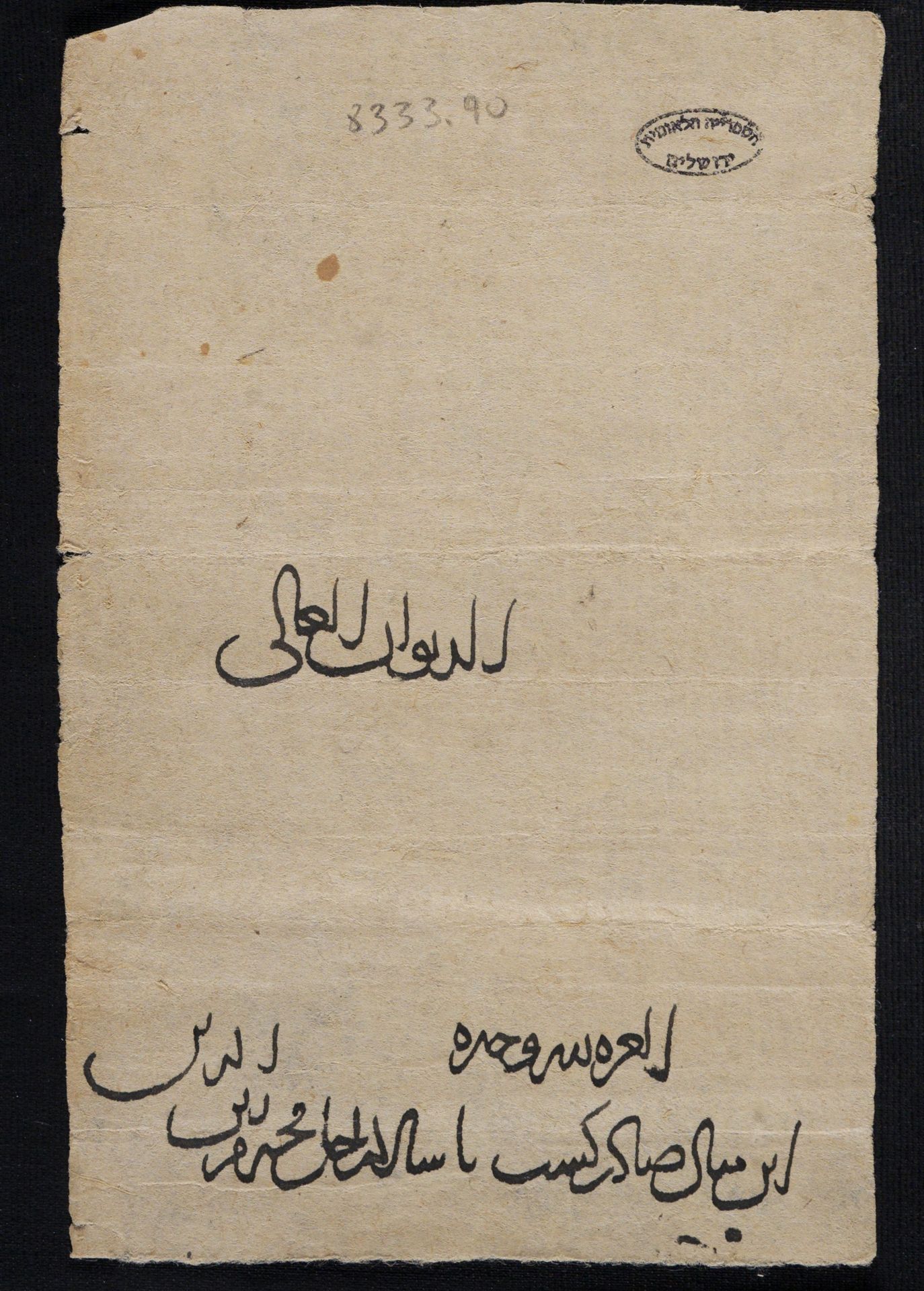
This document features a chancery script written in rotulus format. The script is curvilinear and proportioned with a variable ductus and pervasive hairlines. Letter shapes are regular and consistent: the open spaces in the heads of letters such as ḥāʾ and ʿayn are clear and pronounced, and the bowls of letters such as wāw and qāf are rounded. Abusive ligatures are frequent. Baselines are nested and stacked, with each succeeding word beginning above the previous. Words are stacked toward the ends of lines. Interlinear spacing is wide. Lines slope upward. The heading carries the title al-Dīwān al-ʿĀlī, followed by an ʿalāma (al-ʿizza li-llāh waḥdahu) set at a conspicuous distance from the preceding text, consistent with standard chancery layout convention. The document is approximately 10 cm wide and written on a distinct paper stock.
These features — curvilinear and proportioned script, variable ductus, pervasive hairlines, abusive ligatures, nested and stacked baselines, stacked words at line-ends, wide interlinear spacing, and upward-sloping lines — conform to the graphic conventions of the Abbasid/Buyid chancery of Baghdad.
Further Reading
- Rustow, Marina. 2020. The Lost Archive: Traces of a Caliphate in a Cairo Synagogue. Princeton: Princeton University Press.
- Shawe-Taylor, Edward. 2026. “Abbasid Continuities and Seljuk Innovations: Persian State Documents in the Bamiyan and Firuzkuh Papers.” In State Documents from the Medieval Islamicate World, edited by Nadia Vidro, Arezou Azad, and Marina Rustow. Edinburgh University Press, forthcoming.
Glossary
Abusive ligature — the joining of canonically non-connecting letters (e.g. alif) to a succeeding letter; a feature of both cursive and chancery scripts
ʿAlāma — a pious motto used as a signature by officials to authenticate state documents; usually placed at the head of a document
Curvilinear — a script characterised by long, rounded, flowing strokes, most evident in the loops of letters such as fā or ʿayn, and in the bowls of letters such as yāʾ or nūn; distinct from cursive
Ductus — the movement of the pen caused by the gestures of the scribe when writing; particularly relevant when describing variation in stroke width between thick and thin strokes
Hairline — a very fine, thin stroke, typically connecting letters
Interlinear spacing — the space between lines of text
Nested baselines — baselines of individual words which are slanted, with succeeding words beginning above the end of the preceding word
Proportioned script — a script in which letterforms are executed according to consistent geometric ratios, typically based on the height of the alif and the diameter of a circle; associated with formal calligraphic training
Rotulus — a document in the form of a long vertical scroll
Stacked words — words written above one another toward the end of a line, a deliberate layout convention of the chancery style