جزئیات
بارگذاری
ذخیره دادههای پایگاه شرق مکنون
با انتخاب یکی از گزینههای زیر، ذخیرهسازی متن تمامی نتایج جستجویتان در پایگاه دادههای شرق مکنون شروع میشود.
برای شروع ذخیرهسازی، یکی را از گزینههای زیر را انتخاب کنید.
توجه: ممکن است فرایند ذخیرهسازی دقایقی طول بکشد. لطفاً صبر کنید.
- Microsoft Word (.docx)
- JSON
- XML
Download started
محتوا
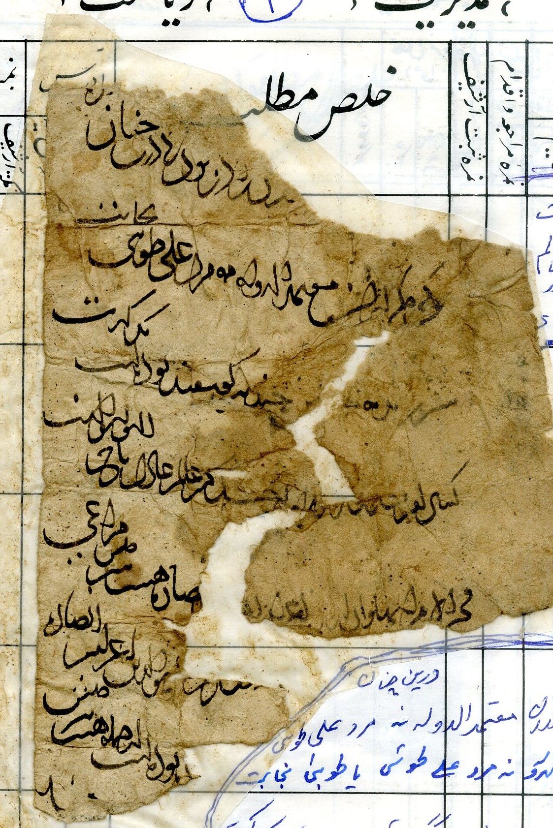
Fragment of a document concerning eight pasture ewes. The text was written by a skilled scribe in a calligraphic style.
تاریخ
- The Hijri calendar: Early Jumādā I (year missing)
جزئیات
Firuzkuh 80
Silver (given following internal peer review)
توصیفات فیزیکی
Black ink, Incomplete (top and bottom thirds missing), damaged in the middle in a zigzag rip.
5
نشریات مرتبط
- Khwaja Muhammad and Nabi Saqee, Barg-hāy az yak faṣl, yā asnād-i tārīkhī-yi Ghur (Kabul: Saʿīd 1388/2009) (Pages: 126-127)
The IEDC transcription has been revised from this publication.
شماره قفسههای مرتبط
دادههای پایگاه دیجیتال شرق مکنون
1159
26/01/2025
24/05/2026
ارجاعات
Ofir Haim
Arezou Azad, Nabi Saqee
The transcription has been revised from a previous publication (see Publications), the translation is the original work of the IEDC Team (as yet unpublished in peer-review print)
Images of this Text displayed on this web page are provided by Nabi Saqee.
© Nabi Saqee, All rights reserved.
If you wish to reproduce these images please contact Nabi Saqee.
© Nabi Saqee, All rights reserved.
If you wish to reproduce these images please contact Nabi Saqee.
تماس
invisible_east@conted.ox.ac.uk (Please include the above permalink when contacting the editorial team about this Text)