Details
Download
Download IEDC Data
You are about to download data for the current text from the IEDC database.
To start the download, please click on your desired format below.
Note: it can take up to several minutes to download your data, so please wait whilst it processes
- Microsoft Word (.docx)
- JSON
- XML
Download started
Content
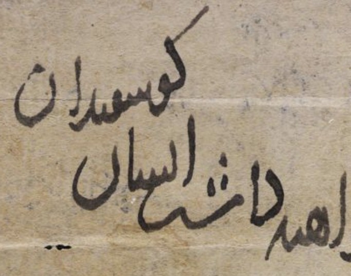
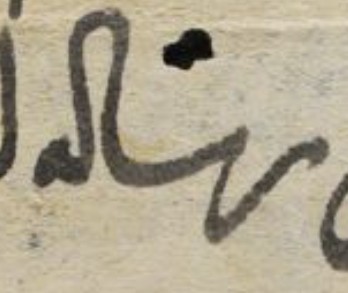
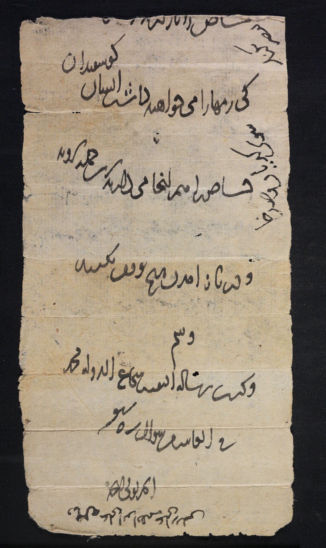
Decree concerning the transfer of the royal sheep that are kept together with other flocks, probably in Kiriyān and Ṣadkhā.
Dates
- The Gregorian calendar: 07 March 1180 (1180-03-07)
- The Hijri calendar: 10 Shawwāl 575 (0575-10-10)
Details
Ms.Heb.8333.63, recto
Silver (given following internal peer review)
Physical Description
Incomplete (top part missing), black ink, verso side reused 2 years later.
9
People
Publications
Related Shelfmarks
IEDC Data
174
02/09/2024
23/08/2026
Citations
Ofir Haim
Arezou Azad, Nabi Saqee, Pejman Firoozbakhsh
The transcription and translation are the original work of the IEDC Team (as yet unpublished in peer-review print)
Images of this Text displayed on this web page are provided by National Library of Israel.
© National Library of Israel, All rights reserved.
If you wish to reproduce these images please contact National Library of Israel.
© National Library of Israel, All rights reserved.
If you wish to reproduce these images please contact National Library of Israel.
Contact
invisible_east@conted.ox.ac.uk (Please include the above permalink when contacting the editorial team about this Text)